Extract UI Items
Jekyllrb Home Page
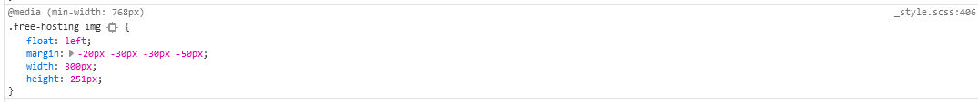
User Interface Discussion
I liked this UI item because I thought it was cool that the cat was sticking outside of the box that it was in. I actually did think that it was cool to see that the whiskers were popping out of the box and into the words as well before it was showcased in the demo video.
The techniques used to create this UI item: looks like they used a "float: left" to make the picture be on the left side of the text. From what it looks like, the picture was meant to go outside of the grey box that it was in because of it's max width and height, unless you changed it. If the margins were adjusted, you could get the octo-cat to be outside of the area and also off the words.
Jekyllrb Docs Page
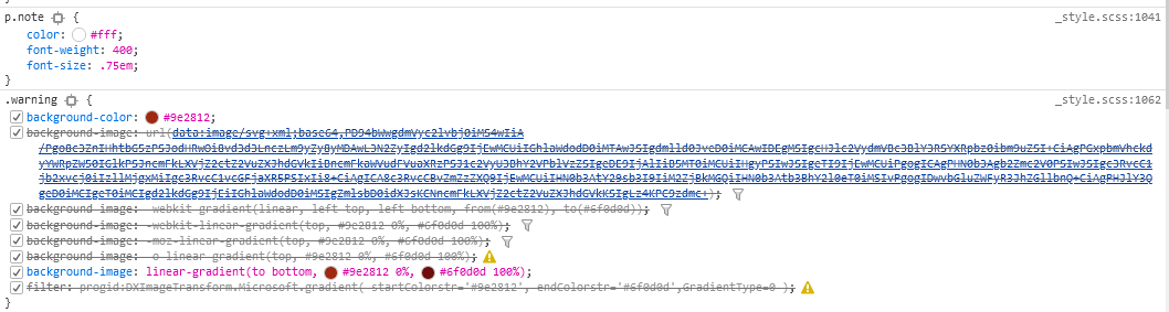
User Interface Discussion
I liked this UI item because of how the graphic looked like it wrapped around and was hugging the back.
The techniques to create the UI item. To be honest, I'm not sure. I looked at the code and couldn't tell which code was for it? I tried changing the attribute class named warning but I could only get the color to change. Also a lot of the CSS had lines through them.
Jekyllrb Home Page
User Interface Discussion
I like this UI item for the fact that the arrow was inside the grey area and it was pointing to "GitHub" from outside the area, just like how the Octo Cat image was.
The techniques for this UI Item: They had the picture float right. They had the position as absolute. I see that changing the position to another value changes the placement of the arrow causing it to not do what it needs to do. They also have a width of 73px and height of 186px and a right and bottom attribute to position it where it needs to be.
Jekyllrb Home Page
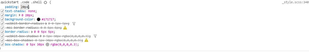
User Interface Discussion
I like this UI item because of the fact that it's like a small message box that pops out at you in a specific place on the page. Anything that can stand out in a place that doesn't look like it should be there is cool to see. /p>
The techniques used for this item: They used padding and margins over the maroon part of the background and oversized it to make it stand out. I'm not sure how they positioned it where it is on the page.