My Demo
Me breakdancing
Devil's Lake State Park
Paddle Boarding
Friend Breakdancing
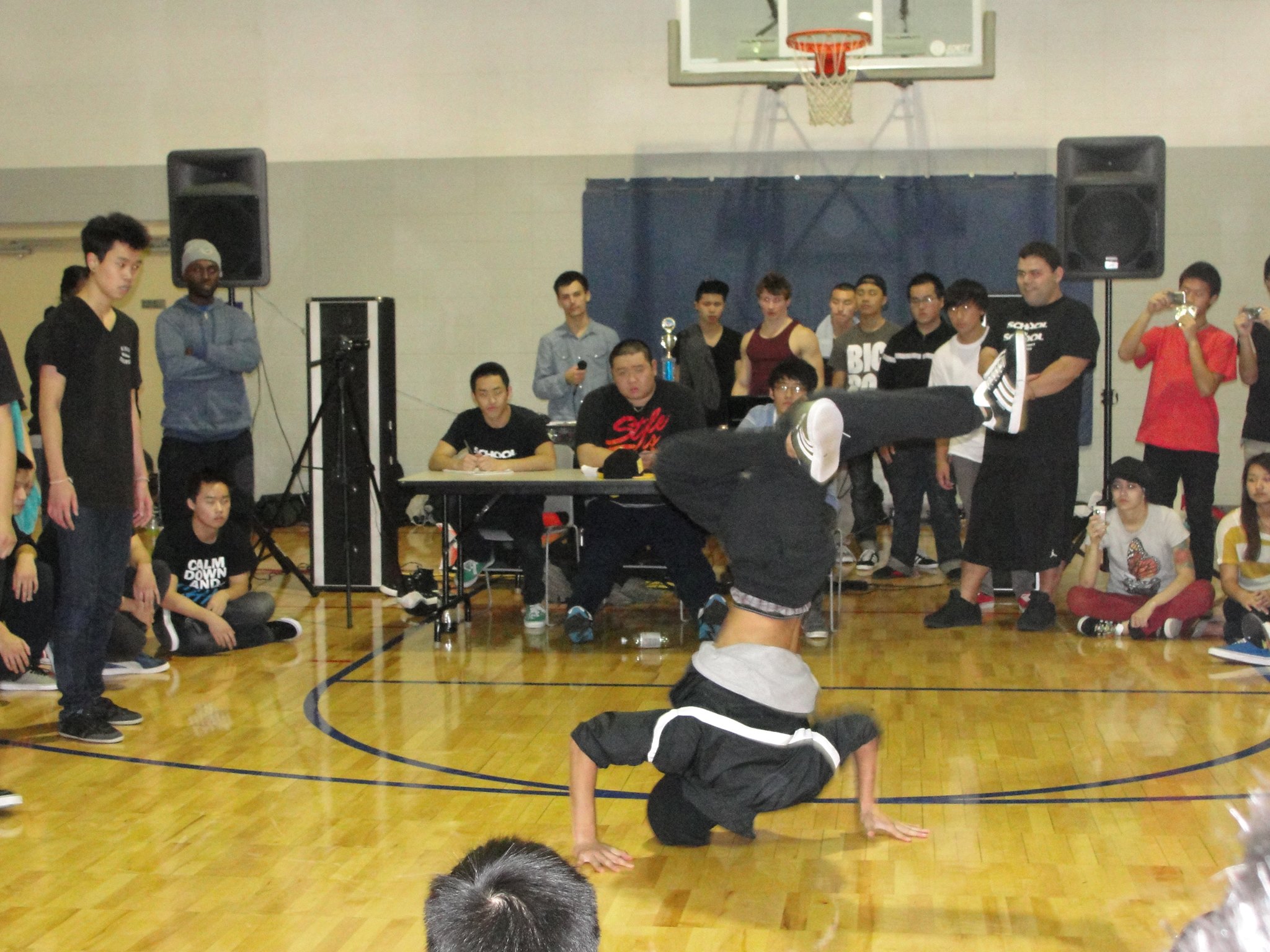
Me breakdancing
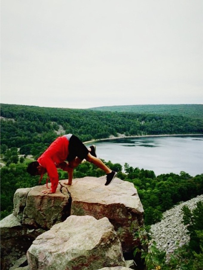
Devil's Lake State Park
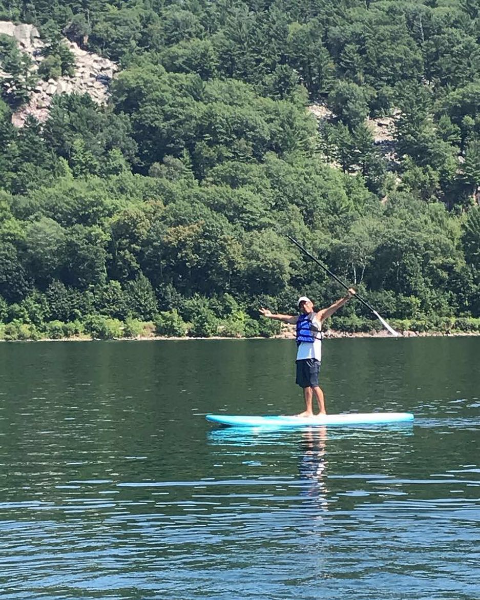
Paddle Boarding
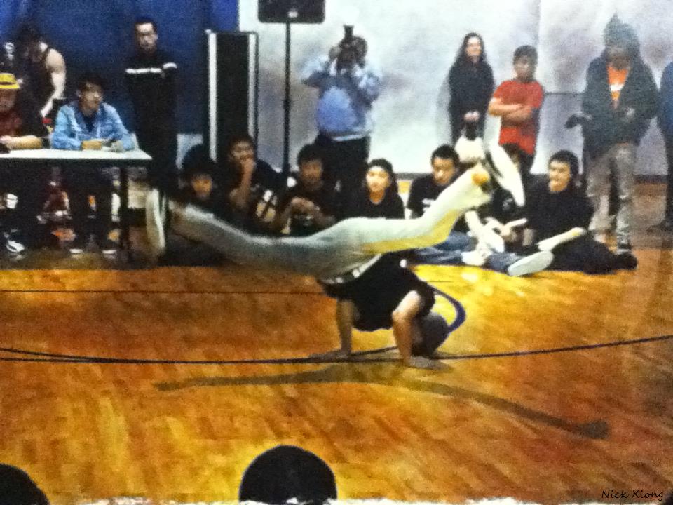
Friend Breakdancing
For this demo, you will need to create an unordered list with list elements.
Style the list elements so that they are in a polaroid frame. Add styles to make it look realistic.
Create a hover effect
Add a polaroid caption by using the P tag attribute.
Create li:nth child pseudo class selectors and give them a transform property and rotate them how ever many degrees you'd like.
    body {
      background-image: url("../images/bg.jpeg");
      font-family: 'Homemade Apple', cursive;
      font-size: 20px;
      background-size: cover;
      background-repeat: repeat;
      color: #000;
    }

    ul {
      position: relative;
      margin: 0;
      padding: 0;
    }

    li {
      text-align: center;
      display: inline-block;
      list-style: none;
      position: relative;
      border: solid 12px #fff;
      background: #fff;
      box-shadow: 0 0 15px 0px #555;
      transition: all 1s ease;
      -o-transition: all 1s ease;
      -moz-transition: all 1s ease;
      -webkit-transition: all 1s ease;
      top: 50px;

    }


    li:hover {
      top: 0px;
      opacity: 0.5;
    }

    li:nth-child(1) {
        transform: rotate(10deg);
    }

    li:nth-child(2) {
        transform: rotate(0deg);
    }

    li:nth-child(3 ){
        transform: rotate(-10deg);
    }

    li:nth-child(4) {
        transform: rotate(20deg);
    }

    p {
      margin:-15px 0 0 0;
      padding-top: 5px;
    }

    .light {
      border-radius: 50%;
      position: absolute;
      left: 0;
      right: 0;
      width: 700px;
      height: 700px;
      background: #fff;
      filter: blur(100px);
      opacity :0.3;
      pointer-events: none;
    }