Code
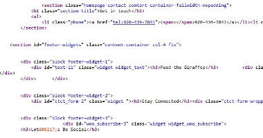
The beginning code of the NEW Zoo website was readable until it got down a little pass the body. In my opinion, the indentation was kind of messy with all the UL's and LI's. I didn't even want to go through it. There were a lot of section and article elements making up the home page of the website and the code was a lot easier to follow and read than the rest.
User Interface - UI

The articles on the website each had a button that we could click. If we hovered over them, the button would move up. The only concern I had was that each article was inconsistent. In the left image of the UI picture, you can't see the button, but in the right image, you could see the button. In other articles, some text were off the article image so you couldn't see the button. Overall for the UI, everything was fine. Navigation was easy to follow and I was able to know exactly where I was on the site.
User Experience - UX

I feel as if the website didn't showcase any of the fun things you could do at the NEW Zoo. The color scheme and font style was very dull and didn't add an exciting feel.
Summary
In summary, the NEW Zoo website had decent code structure. Nothing was really appealing. You would only go to this site if you were interested what animals the NEW Zoo had or what they had to offer.