Code
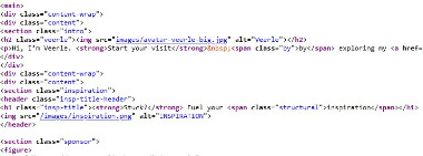
Most of the code on Veerle's website that I see are divided by sections. Her whole website is made up with a lot of pictures and few paragaphs/text to go along with it.
User Interface - UI
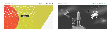
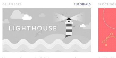
Many interactions with the pages were colors fading in and out whenever you hovered over them. The buttons have an arrow sliding from the left to the right. In my own opinion, I would prefer if the hovers over the images started off grey/faded out and then have a style where it fades into the color. Other than that, I find the website to be very organized and also visually pleasing. All the colors go well.
User Experience - UX
Overall, the functionality of the entire website was good. Everything seemed to work well. This website would have a ton of value for someone who would like tutorials on creating certain colors, images, and designs since she provides that.
Summary
In summary, Veerle's website was well structured and organized. She used a lot of colors, but she made them mix well together which made her web site look more appealing.